Color Palette Styles
Color grading style. Compare 10 color palette looks for your storyboard. Use the still previews to shortlist a direction, then read each preset's lighting, palette and composition notes.
These are still-image references. Choose your Storyboard style separately.
Reading the Color Palette looks
- Teal & Orange
- A scene with teal and orange Hollywood blockbuster color grade. Warm skin tones popping against cool shadow complementary contrast. High saturation summer-movie palette energy with crushed blacks and blown-out highlights.
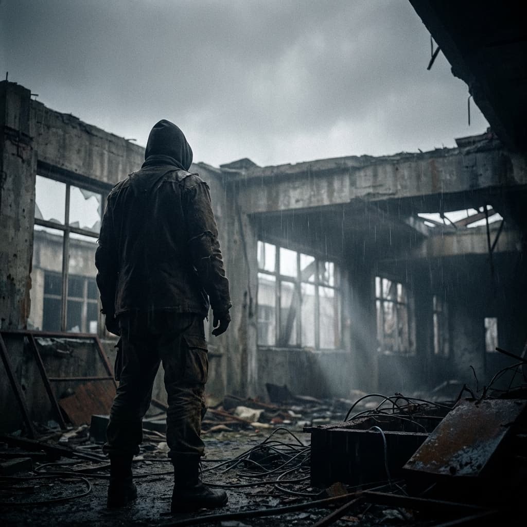
- Desaturated
- A scene with desaturated muted color palette in 2000s investigative style. Melancholic washed out tones in olive brown and steel grey. Low saturation overcast lighting with green-brown procedural atmosphere. Emotional weight in subdued color expression and flat diffused light.
- Neon Cyberpunk
- A scene with neon cyberpunk color saturation in 2010s neo-noir style. Hot pink and electric cyan with purple undertones. Synthwave retrowave LED glow aesthetic radiating energy, rain-soaked reflections multiplying neon across wet surfaces.
All 10 styles

Teal & Orange
Hollywood blockbuster
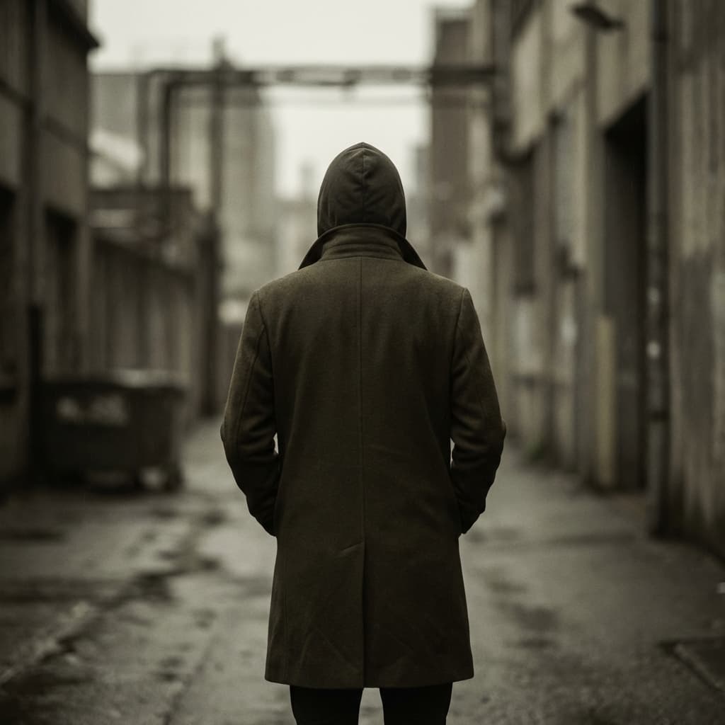
Desaturated
Muted melancholy
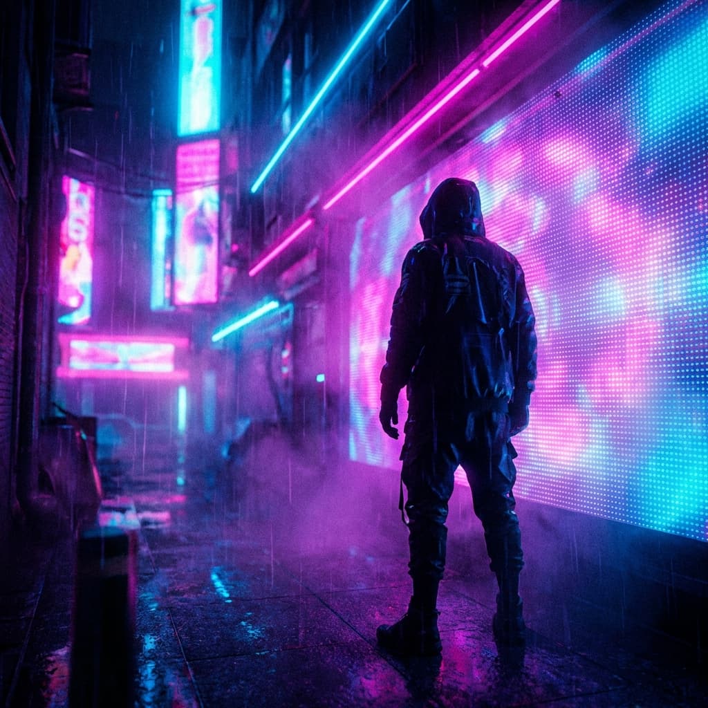
Neon Cyberpunk
Pink cyan purple
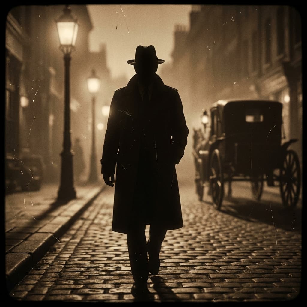
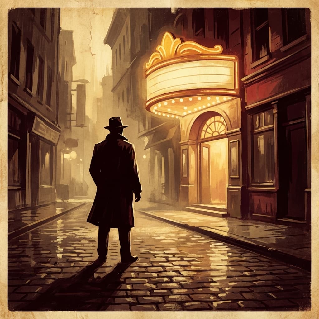
Sepia Vintage
Aged photograph
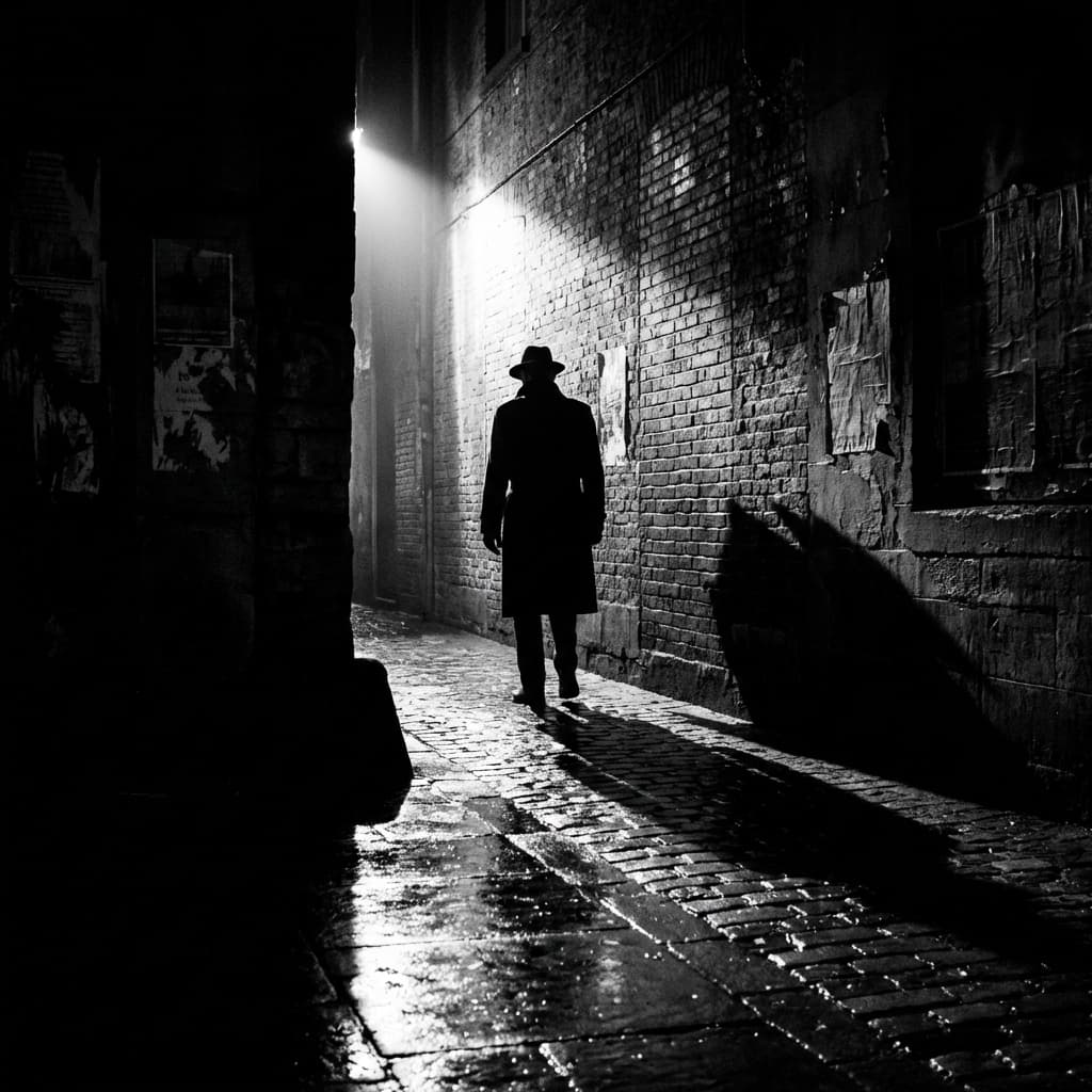
High Contrast B&W
Stark monochrome
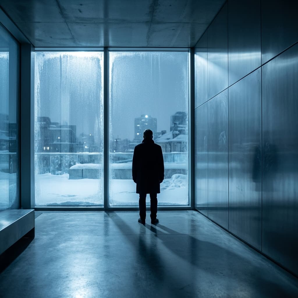
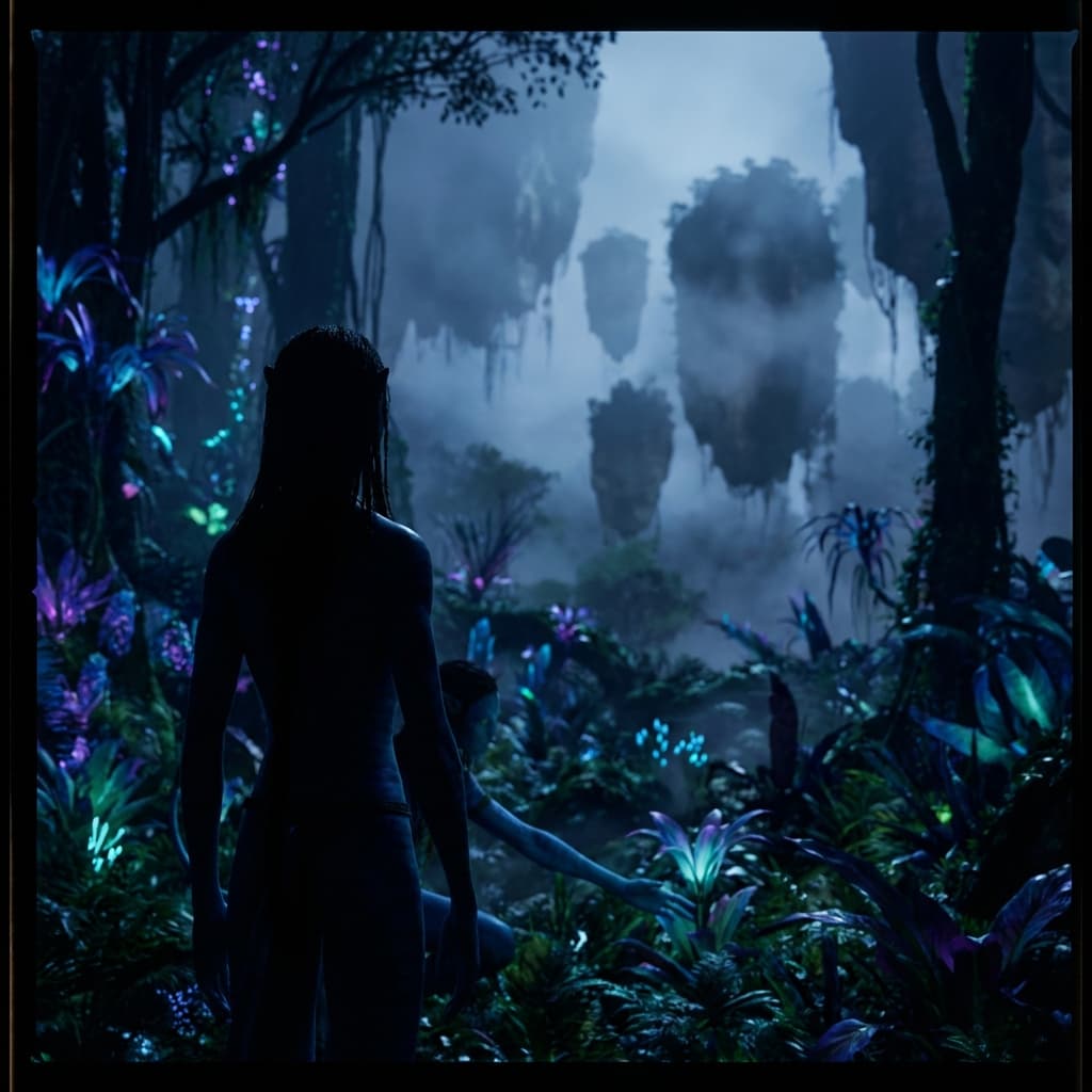
Cold Blue
Icy clinical
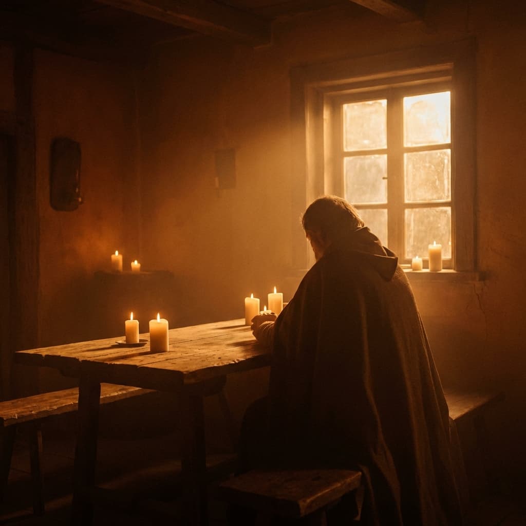
Warm Amber
Golden hour glow
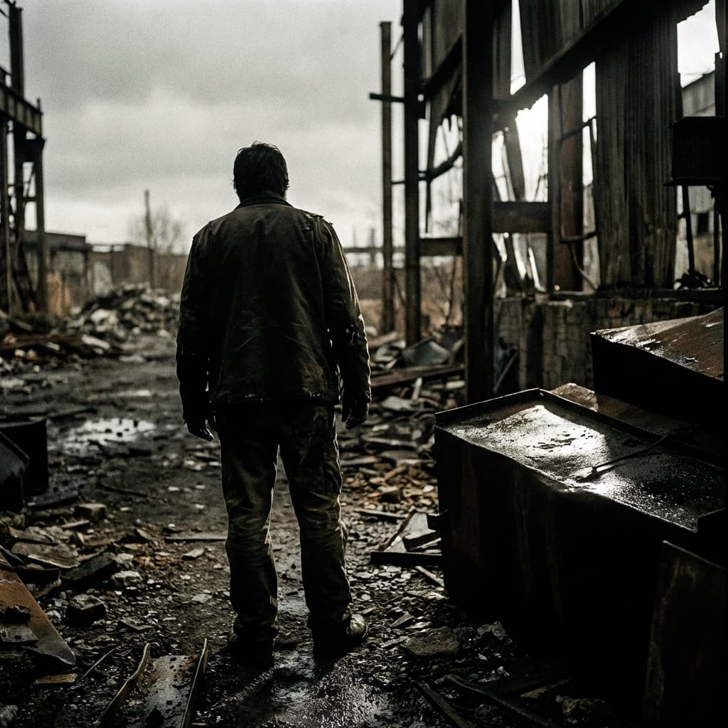
Bleach Bypass
Silver retained contrast
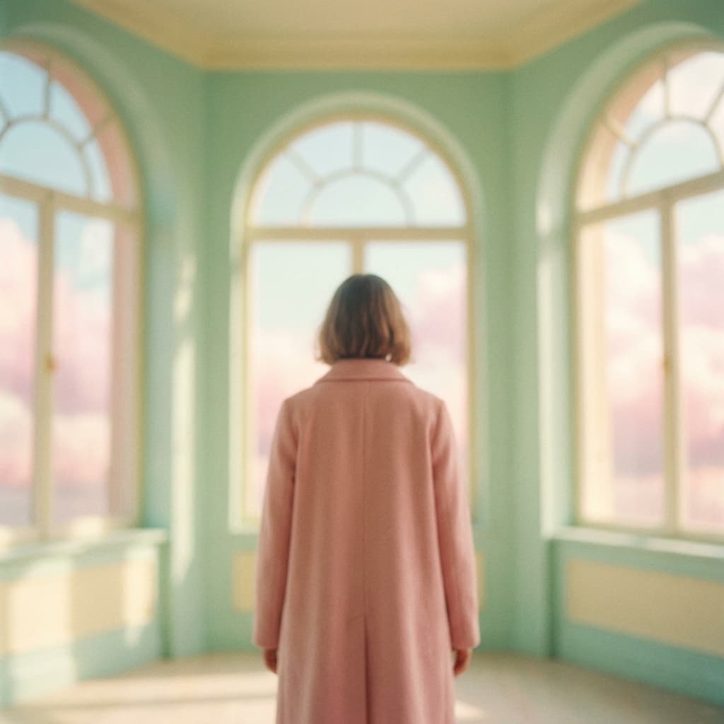
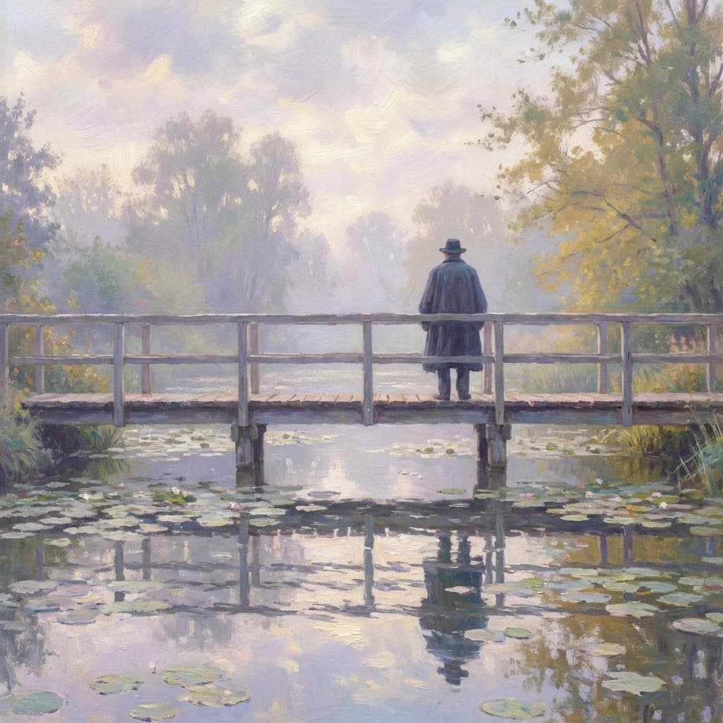
Pastel Soft
Dollhouse pastel pink

Acid Green
Glowing green terminal code
Plan Your Color Palette Storyboard
Use the visual notes to brief your shots, then select a Storyboard style or adapt a custom recipe in the wizard. Catalog browsing does not select it for you.