Typography Styles
Title/text styling. Compare 10 typography looks for your storyboard. Use the still previews to shortlist a direction, then read each preset's lighting, palette and composition notes.
These are still-image references. Choose your Storyboard style separately.
Reading the Typography looks
- Classic Movie Poster
- A scene with classic Hollywood movie poster typography in the 1950 golden age studio tradition featuring bold serif titles in gold and billing block credits. Theatrical one-sheet key art format with hand-painted illustration style. Crimson and midnight black cinema graphic design elegance. Studio lighting setup with anamorphic lens flares highlighting metallic letterforms, depth of field focused on title treatment.
- Film Noir Titles
- A scene with film noir title card typography in the 1944 classic noir tradition featuring slanted italics and venetian blind shadow patterns. Dramatic drop shadows in stark white on black pulp novel covers. Detective mystery font evoking hard-boiled private eye atmosphere with amber accent lighting.
- Korean Calligraphy
- A scene with Korean calligraphy title typography in 2003 Korean revenge-thriller poster style featuring brush stroke hangul characters. Traditional ink painting influence with sumi black on hanji cream. Bold brush calligraphy design celebrating Korean visual heritage with vermillion seal stamps. Macro lens close-up on brushwork texture, flat even lighting revealing ink gradation depth.
All 10 styles

Classic Movie Poster
Hollywood billing block
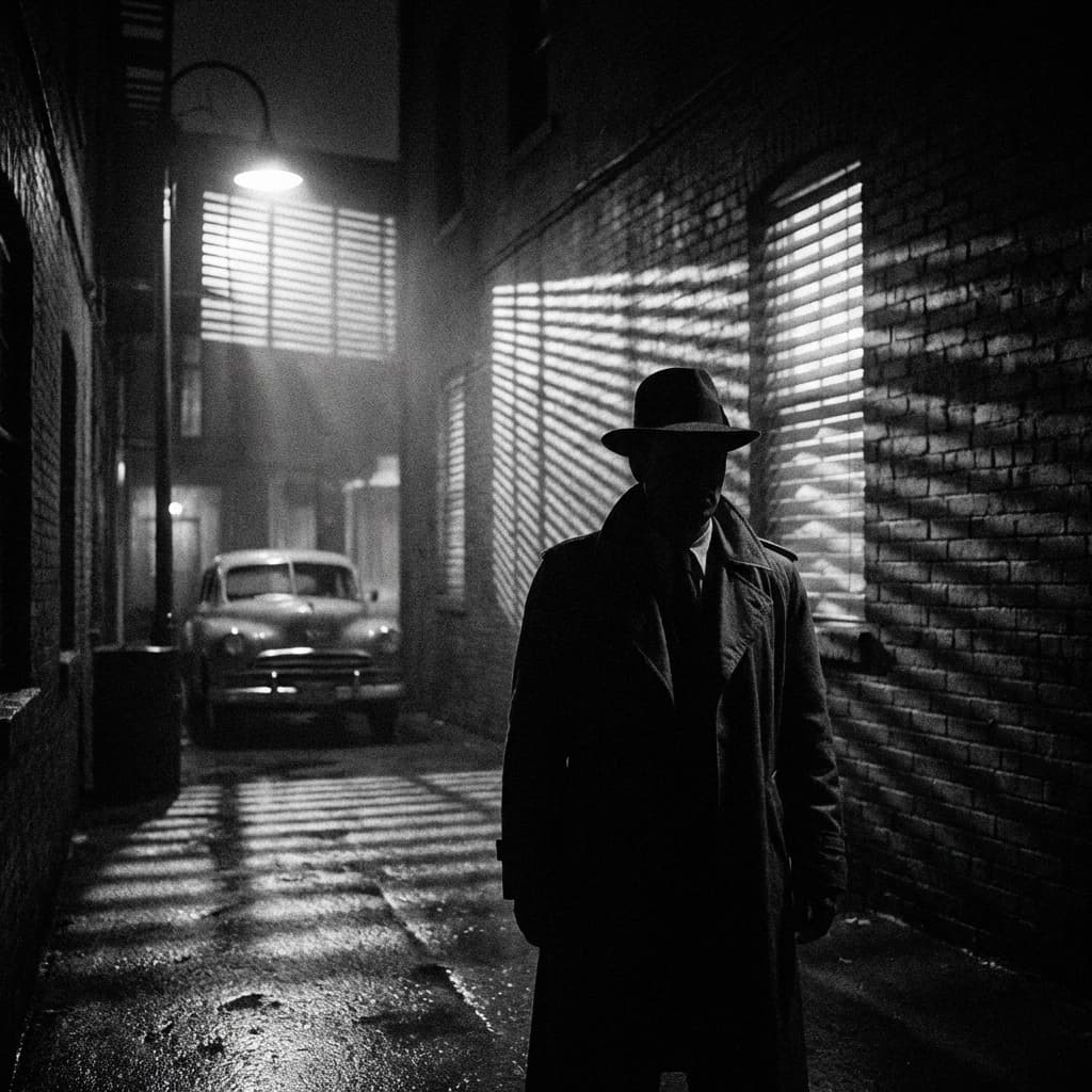
Film Noir Titles
1940s slanted mystery
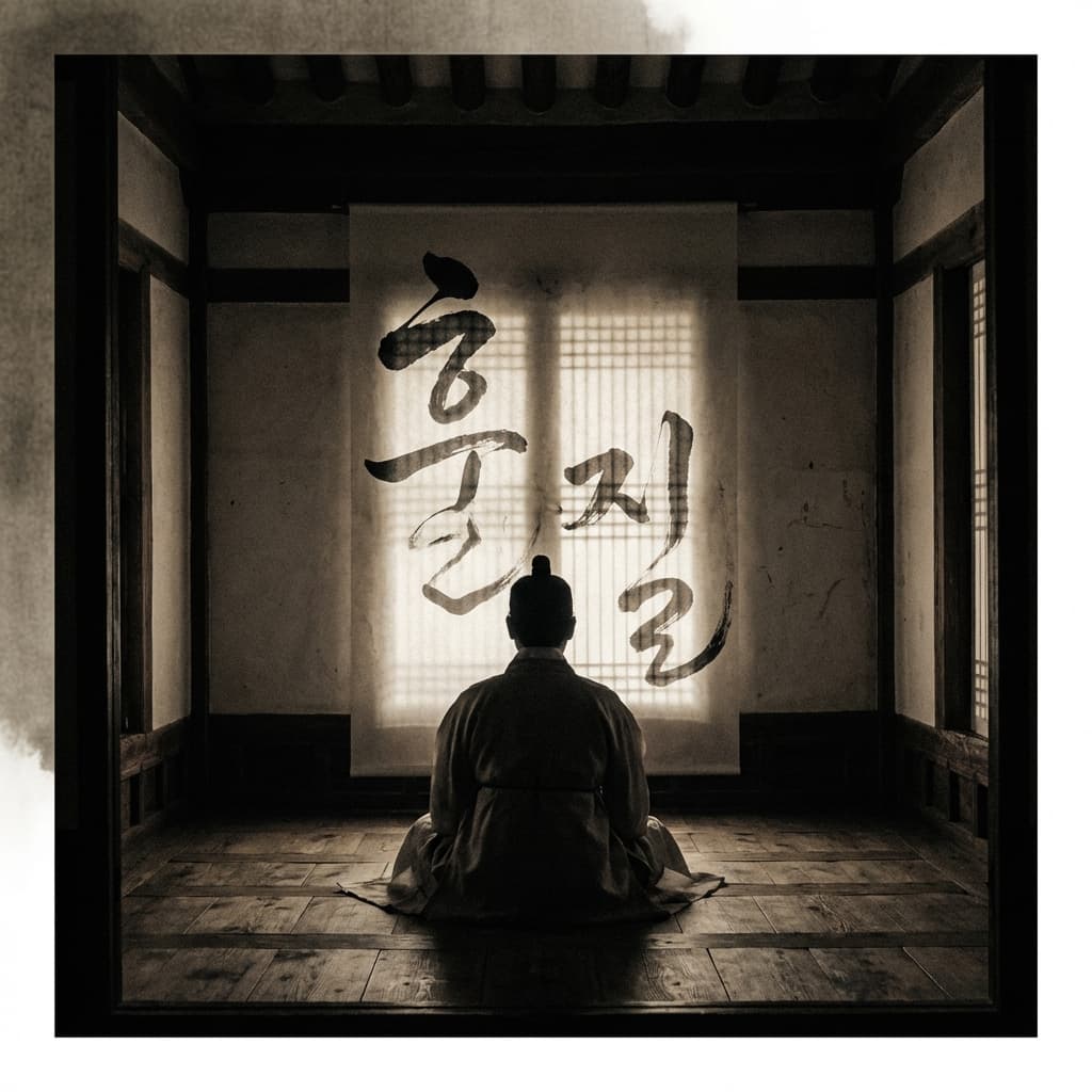
Korean Calligraphy
Brush stroke hangul

Blockbuster 3D
Metallic chrome epic
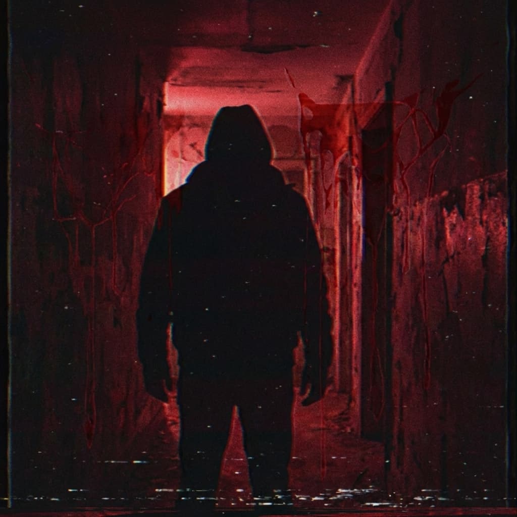
Horror Dripping
Slasher blood drip

Sci-Fi Digital
Holographic HUD

Handwritten Indie
Quirky imperfect
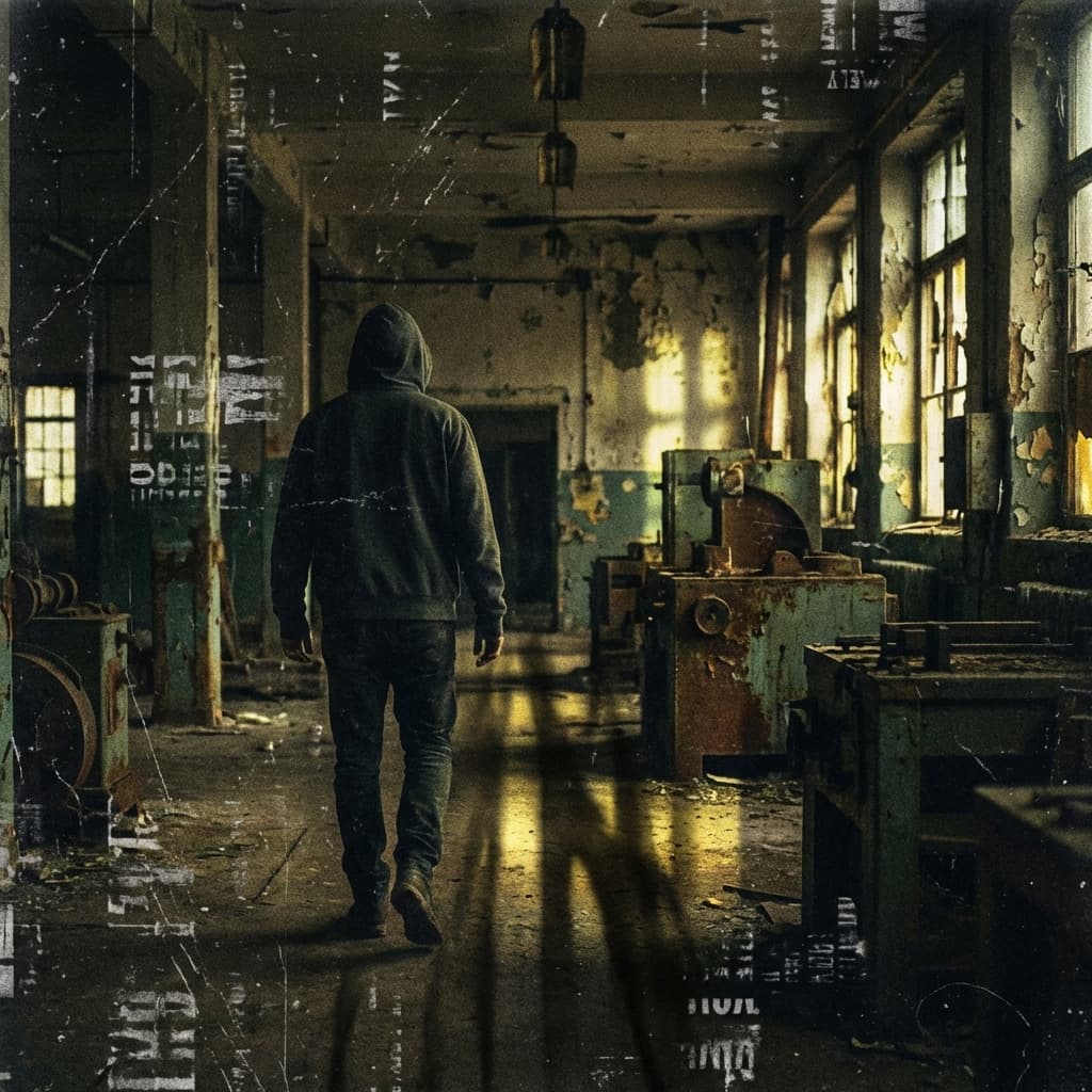
Vintage Grunge
90s distressed

Asian Brush Stroke
Wuxia calligraphy

Retro 80s Neon
Synthwave chrome



Plan Your Typography Storyboard
Use the visual notes to brief your shots, then select a Storyboard style or adapt a custom recipe in the wizard. Catalog browsing does not select it for you.